How Federica Fragapane visualized organized crime in northern Italy
Federica Fragapane is a freelance information designer living in Milan, Italy whose work has been published in United Nations reports, and magazines and newspapers including Wired Italia and La Lettura. She recently won Honorable Mention in Data Visualization at the Kantar Information is Beautiful Awards. We spoke to Fragapane after stumbling across her ambitious and elegant master’s thesis which visualizes organized crime in northern Italy.
How did you become interested in information design?
I began enjoying information design for journalism at my university, the Politecnico of Milan, where I attended the DensityDesign Studio course. I became really interested in the field of data visualization and decided to do an information design project for my master’s thesis.
Can you tell us why you wanted to visualize organized crime in Italy?
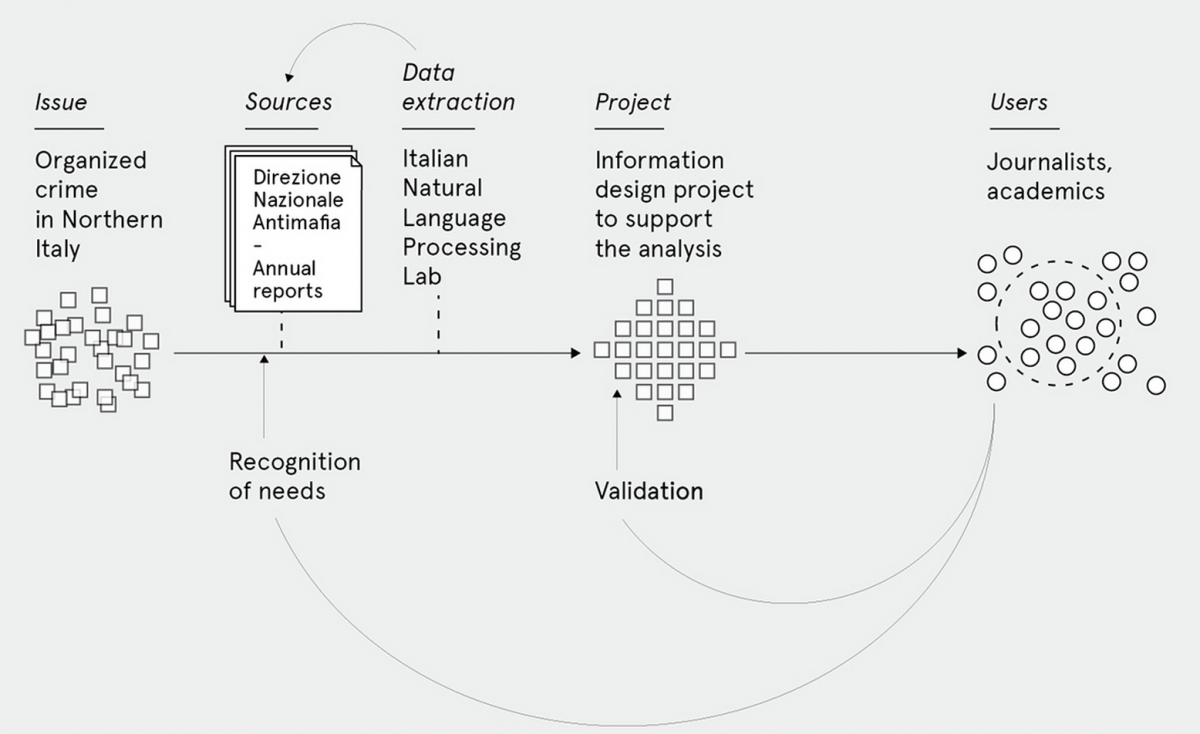
One of the biggest problems in Italy is the phenomenon of organized crime. The issue of organized crime in northern Italy has been controversial for decades. I focused my research on northern Italy in order to [tighten] the scope of my analysis.
How did you get the data?
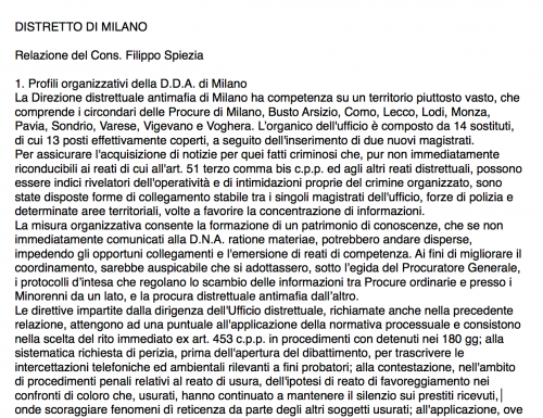 I decided to analyze the annual reports of the Direzione Nazionale Antimafia (the National Anti-mafia Directorate). I needed a tool to extract the data, so I contacted the “Antonio Zampolli” Institute of Computational Linguistics and started a collaboration with the ItaliaNLP Lab, a research laboratory that “gathers researchers, postdocs and students from computational linguistics, computer science and linguistics who work on developing resources and algorithms for processing and understanding human languages, with particular attention to the Italian language.”
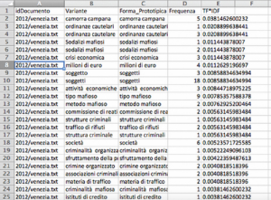 I analyzed the chapters of the reports dealing with the situation in Northern Italy and I prepared the .txt files to be extracted. The ItaliaNLP Lab researchers performed the extraction for my analysis. They used T2K (Text-To-Knowledge), a tool that allows you to automatically extract linguistic and domain-specific information from text.
How many files did you get and how did you clean them?
To date, 3,999 pages have been analyzed. I personally inspected and cleaned [the files] using Microsoft Excel.
What was the process of visualizing this data?
Thinking about audience
I started designing an interface that allows the users to explore the visualized data. The users of the project are journalists and academics—experts who constantly study and analyze the phenomenon of organized crime. I wanted to do a project that could help them in their studies. During the design phase, I was in contact with journalists so as to constantly evaluate the usefulness and the clarity of the project. Every visualization has been checked by the journalists who collaborated with me and by my supervisor Paolo Ciuccarelli.
Sketching
Regarding the visualizations, as an information designer, I’m used to sketching the visual models and then testing their effectiveness using the actual data. So I first made sketches and at a later stage I visualized the collected data with Adobe Illustrator. Then I designed the interface and the possible functionalities.
Designing the interface
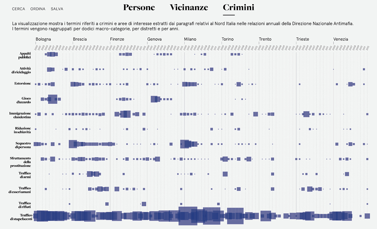
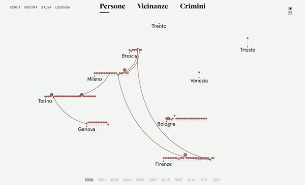
The interface is divided into three sections: Persone (People), Vicinanze (Places) and Crimini (Crimes). I grouped the terms into 12 categories: public procurement, money laundering, extortion, gambling, illegal immigration, enslavement, kidnapping, prostitution, arms trafficking, human trafficking, waste trafficking, and drug trafficking.
Can you walk us through some examples of your visualizations?
In the following visualization, the categories of crime have been [placed] along the y axis with the analyzed cities along the x axis. Every square represents a category: the size of the square indicates the frequency in the documents. For every city, I show the frequency of each category over time (the research covers the time period between 2000 and 2012).
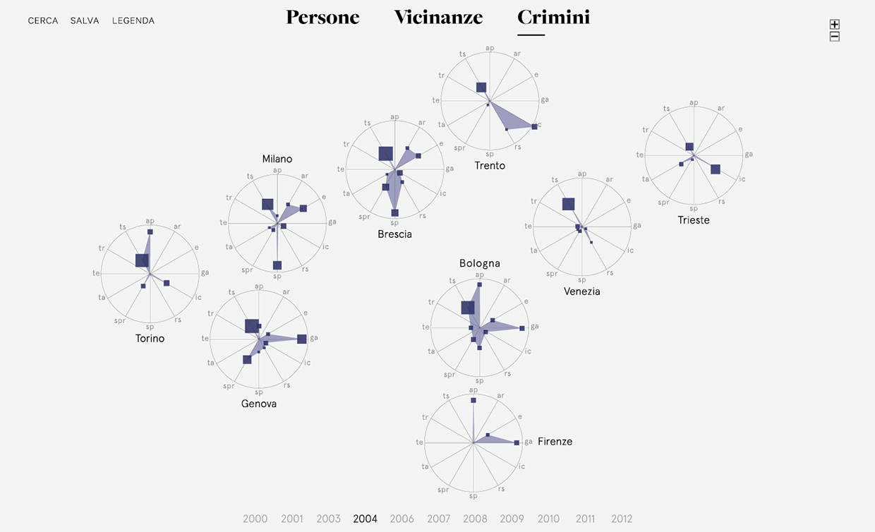
In this next visualization, we look at the information for 2004. Every city has been drawn as a radar. The radial lines for each city represent the categories of crime (ap is Appalti pubblici, for example, or public procurement). 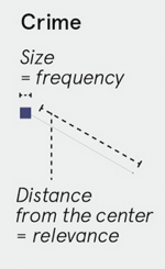 The size of the square indicates the frequency of the crime and the distance from the center indicates the relevance in the document. This information has been calculated by the tool with the tf-idf function, “a numerical statistic that is intended to reflect how important a word is to a document in a collection or corpus,” according to Wikipedia. This visualization allows the user to analyze the different situations in the examined cities from year to year.
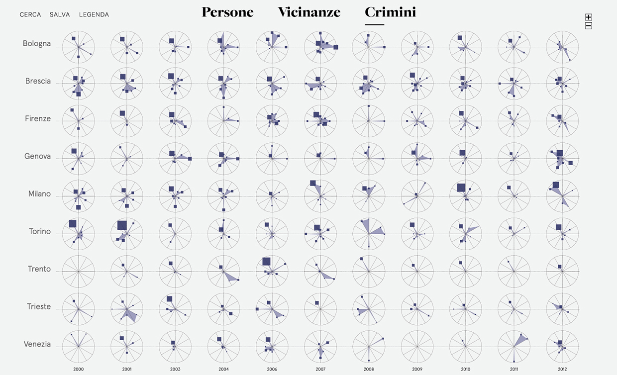
I also designed a visualization that shows all the years, so as to allow further comparisons.
Is this project interactive online?
Not yet. All images are screenshots from the interface that I’m still designing.
How do you see your work fitting into the discipline of information design?
I think this kind of analysis can be replicated across Europe and around the world. The structure of the interface is not strictly connected with the sources I used: in this way this project can be developed using other reports or documents. There are many projects that already use complex data in order to analyze and understand crime and I think this field of information design can be very useful to support and help this kind of study.
What advice do you have for people that want to publish their visualizations?
My advice is to be always ready to learn. During my studies I had also the fortune to work for two years at Accurat, the information design agency with offices in Milan and New York, founded in 2011 by Giorgia Lupi, Simone Quadri and Gabriele Rossi. During that period I learned a lot.
In this field is very important to keep a balance between aesthetics and content validity and this is one of the aspects that most intrigues me: I learned to always keep in mind both factors.
Every visualization tells a story and it’s important to choose the appropriate data to use and the appropriate way to visualize them in order to create a meaningful and interesting narrative. Besides, I think it is important to get inspired from all the visual forms that surround us and to keep an archive of these sources of inspiration. New languages are often born from the combination of different visual forms.