How The New York Times is tracking Covid-19 cases in the U.S.
Published June 30, 2020.
The New York Times’ map of U.S. cases of Covid-19 is a living webpage that changes with the numbers and relies on a team of over 70 in-house and freelance journalists for data collection and design of Covid-19 cases for U.S. counties and states.
In January, Times graphics editors and international reporters began tracking the number of Covid-19 cases around the world. In the U.S., following the first reported case in Washington on Jan. 21, a small team of national reporters began tracking positive cases of Covid-19 using Google Sheets, and graphic editors visualized the data using Mapbox. As cases spread throughout the U.S., the original dataset became too large to manage and the team enlisted Times developers to build a database from scratch.
The data collection and management for the U.S. map is a 7-day-a-week operation that spans more than 16 hours a day. At first, the Times database included only Covid-19 cases confirmed by positive test results. But since April, it’s expanded to include probable cases and deaths as some states began reporting these based on a CDC standard.
“What really changed overtime is the way that we were collecting the data, the way that we were publishing it,” says Archie Tse, graphics director for The New York Times. “We had to evolve as the number of cases grew exponentially and then also as our desire to publish more tracking information for our readers grew.”
Reporters and researchers have analyzed the data in order to understand the changing trends with Covid-19. New York Times graphic editors also developed a publishing system to keep information up-to-date. Tse likens the process to publishing election results, with different teams collaborating to aggregate and visualize incoming data from various sources.
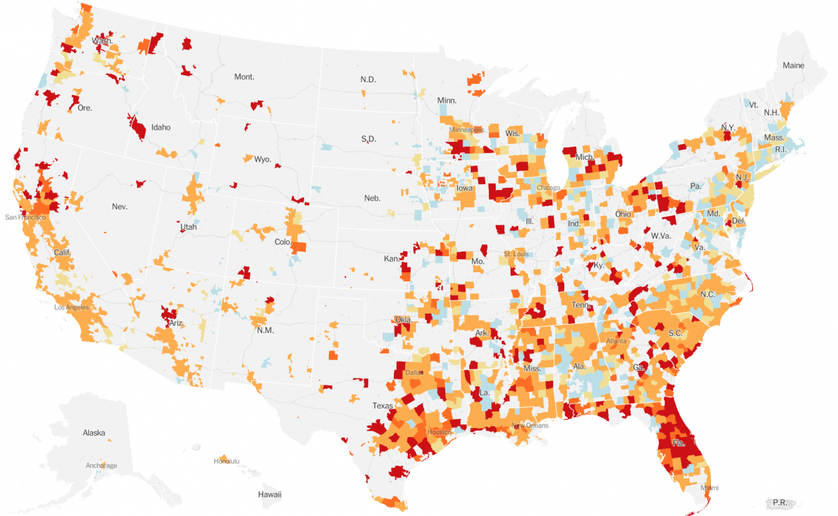
County-level Covid-19 hotspots in the U.S. on June 30. Credit: The New York Times
Storybench spoke with Archie Tse about the teamwork, data collection and visualization involved in the Times’ Covid-19 tracking effort.
Could you describe what your role is in this project?
I’m the graphics director for The New York Times. I lead a department of about 40 visual journalists who do the graphics and interactives and other kinds of multimedia for the Times.
It’s not like this project has a single leader. There are many people who are leading different parts of it. My role might be to kind of help coordinate all the different teams that are working on the project and doing different parts of it. As the graphics director, I also oversee how the pages are designed and what goes on the tracking pages, but those things are also collaborative efforts and so we do these things in consultation with the National and International desks.
The Times is a very collaborative institution, and there’s a lot of very organic work. The key desks involved in the project are Graphics, International, National, Interactive News Technology, Design. There are a whole bunch of teams that are all working together in conversations that bleed into each other from department to department. And there are people from different departments that are just working together all the time now to collect the data to do different parts of it.
How early did you realize that you needed to publish the county-level data?
We started publishing county-level data right away [in March]. We knew that we wanted to have this nuance because when you’re looking at the whole U.S., if you only have state-level data you’re really not helping readers understand what’s happening in their area. Counties were the best possible thing that we can get.
How is a reporter collecting the raw data for the U.S.? What data sources are they pulling from and what is that process like?
The process when it began was just one reporter, Mitch Smith, who is a reporter on the National desk. He’d hear about a case, he would put down the date, where the person was located, any other kind of details he could find about that person. But the number of cases began to go up really fast, and so we brought in more people [from the National desk] to help.
Then we just realized the cases were going up fast, so we actually hired a whole other unit of freelancers to help with data reporting. And these are journalists and actually many student journalists. They were, in some cases, calling the counties or listening to the press conferences. In other cases, counties began to report cases regularly on their websites. Over time, many more of them became more standardized in how they were reporting it, and we were able to use more programmatic methods of getting the data from county websites and state websites.
Now it’s a mix of programmatic and human collection. I anticipate that we need to continue to have human collection for a while, just because even within the U.S., there’s no national standard for how counties or states should report the data.
Why is there a need to keep finding new ways to visualize the data?
We are looking for ways to illuminate what people need to know at different moments of the crisis. What we’re striving to do is to figure out, “What information do people need to understand to have a full picture of where the outbreak is in the country?” As you’re trying to figure out, “Is the country ready to reopen? What states can safely reopen?”, we want to carefully look at what the curves are in those places and understand that most places around the country, there are many places where cases are still going up.
Are these maps and data being utilized by public health officials, city officials?
Yes, so one of the things that we decided to do was to release our raw data publicly. It’s not a usual practice because it’s actually a lot of work to prepare the raw data for publication, so we often don’t have the resources or ability to do that. But we realized we were one of the few places in the country that actually had been collecting county data from the beginning.
We were getting requests from many academics like health researchers, medical professionals. Local, state and federal officials were asking us for the data … for studying policy, to determine where to allocate resources. Being one of the only few authoritative sources of the county-level data, we decided we should release it. So we published the data on GitHub.

Are there limitations to the data itself? What should people be careful about?
The data collection was challenging because what’s being reported is really different across the U.S. and across the world. Be aware that some places are reporting confirmed-only cases, some places are reporting confirmed and probable, some places are reporting the combined total only.
Because of that, things are not necessarily comparable. I think the data generally are consistent for specific geographies. So the data for France is generally going to be reported a certain way. For most parts of the U.S., if the state is reporting a certain way, they’re continuing to report a certain way for a while. But comparing across the geographies is difficult because you have to be aware of who’s including confirmed cases, who’s not. That’s one caveat.
The other caveat is you need to be cognizant that the ability of the local health officials to determine how many actual cases and deaths there are depends on their resources. Some places, like Italy, where they actually ran out of the ability to test, and so the leveling off of cases at that point in [March] was not so much a reflection of them actually having fewer cases, it’s just that they weren’t able to test anymore than they could. And so, the testing ability of places is another big factor that you have to take into account.
Of course, there are other things. I’ll just give a general example: country X may not include deaths that occur at home, but country Y includes deaths that occur at home and deaths that were confirmed in the hospital. And that varies from country to country and place to place. There are lots of challenges in understanding how much [and] what data tells you. But when you do understand that there’s limitations to the data, they still help you understand the scale and trajectory of the crisis.
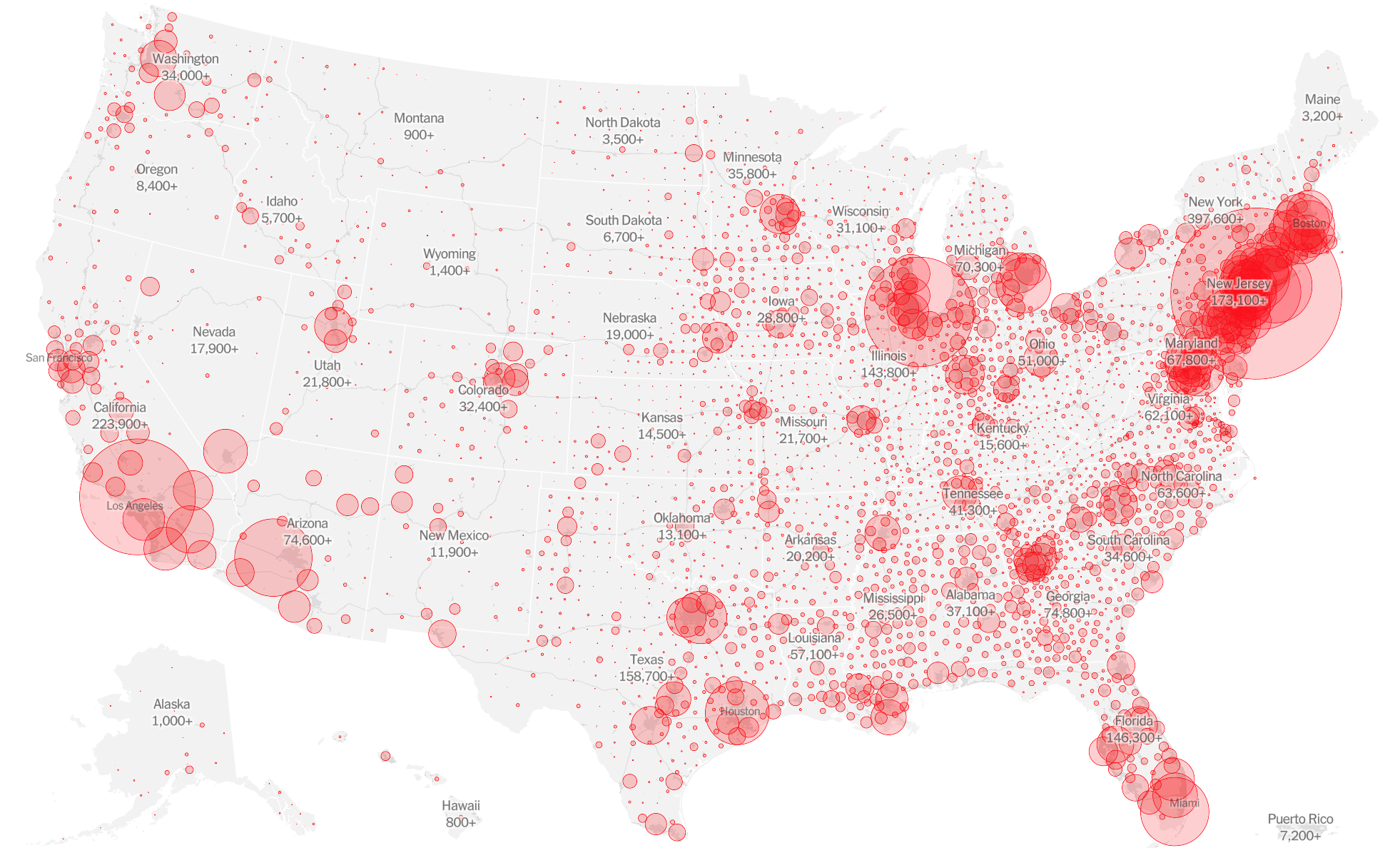
Cover image: Map of total Covid-19 cases in U.S., as of June 30. Credit: The New York Times
- Behind the scenes at ‘How to Save a Planet,’ a climate solutions podcast - January 29, 2021
- How the podcast ‘Science Vs’ investigated a 1971 virus conspiracy - January 11, 2021
- How The New York Times visualized racist historical redlining and urban heat - September 17, 2020